Mac-only Apps
I’ve been evaluating Bear 2 to replace Craft for my reading notes and quasi-Zettelkasten for the past few weeks. I’ve used Craft for over three years, but that tool has morphed into a team note-taking and document-sharing platform that doesn’t mesh well with my needs anymore.
My initial impressions of Bear have been quite positive. Here is an app with a calming, minimalist design, yet in many ways, has more power and capabilities than Craft. And best of all, it intuitively works like you’d expect. Like a Mac app.
When Craft first launched, it was only available on Mac, iPad, and iPhone. The developers went on to create Craft for the Web and Windows to reach a larger audience. Somewhere in the process, more features piled up, basic functions became difficult to figure out, and the app lost some of its Mac whimsy and delight.
Before Bear, I tried Obsidian. Here’s an app that has incredible power and can do practically anything with its endless variety of plug-ins. I tried hard to make it work, but I couldn’t accept its interface and design. I kept tinkering with it to try and make it feel like a Mac app. I realized, eventually, that Obsidian was never going to work for me.
When I think about the apps I use and love the most — Day One, Things, Ulysses, and now possibly Bear — they are only available on Mac, iPad, and iPhone.
What is it about Mac-only apps that appeal to me so much? Perhaps they use Macs themselves and have a laser-like focus on how to make the most of the platform. Maybe it’s because the developers who refuse to expand beyond the Mac all share an opinionated sense of aesthetics and whimsy. It’s hard to pin down the particulars, but you know it when you see it.
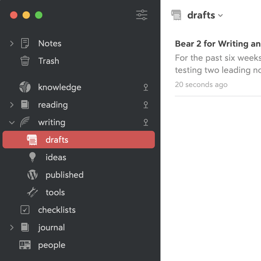
Take, for example, the icon that Bear automatically assigned to my “Drafts” tag in the app sidebar. Who but a Mac developer would write this into their software?
I tip my hat to those Mac developers out there, the crazy ones who continue to think different.
